


michael hunjet tuition
Michael was referred to us by a previous client, which we appreciate as it means our designs have made a positive impact for our existing clientele. He required a modern logo for his expanding tuition business, reflecting on his strong belief that the importance of face to face training is the most effective way of learning. His target market covers a large range of students, from primary school through to tertiary including adults, indicating MHT’s new branding required a broad appeal and relatability. We also felt that a more corporate style might be suitable due to the relevance to higher education, keeping in line with the potential goal industry of a majority of his clients. He also has plans for expansion in the future, requiring versatility for uses over a broad spectrum of applications.
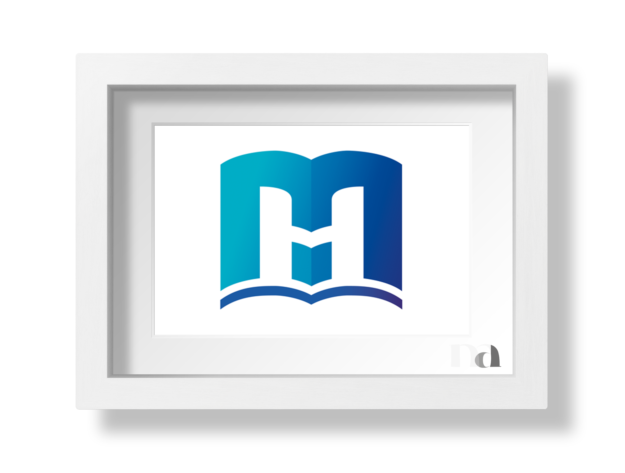
For these reasons we chose a modern sans serif font for his branding. The handwritten style for his catchline compliments the structured title, and is reflective of notes that have been taken in a class, combining to enhance the minimal negative image icon that forms an M, H and T.
The external shape that represents the M is an opened (text) book, with the H being created from the negative space from the M, bridged together to not only complete the letter, but also form two stylised people shaking hands. This represents the face to face service mentioned as a vital component of the business. When combined the M and H also create two separate book shapes. This small to large book ratio reflects the growth their clients can potentially achieve with the help, guidance and support provided by MHT. The smaller book and the bottom cover of the larger textbook form the inverted T.
The colour scheme was selected to represent principles relevant to learning. Green evokes feelings of safety, reliability, kindness and security, whilst blue promotes trust, integrity, responsibility, confidence and honesty, also complimenting the corporate style mentioned earlier.
We expanded their branding with a landscaped version of his logo to suit a variety of uses, including directory signage at MHT’s offices, which was also manufactured and installed by MAD.
